PITCHFORK MUSIC FESTIVal
MUSIC’S UNDERGROUND MEETS THE UNDERGROUND
visual identity, art direction, ad campaign
EVERY YEAR ACROSS LONDON’S SPRAWLING MUSIC SCENE, PITCHFORK ORGANIZES A CITY-WIDE FESTIVAL TO SHOWCASE A VARIETY OF ARTISTS. TO MATCH THE PUBLICATION'S PRIMARILY ONLINE EXISTENCE, I DEVELOPED A VISUAL IDENTITY THAT AIMS TO BOOST VISIBILITY FOR THE FESTIVAL AND THE QUALITY JOURNALISM THAT PITCHFORK IS KNOWN FOR.
Material World
increasingly over recent years, marketing and outreach efforts have steered toward creating new sensory engagements for media. whether it’s pop-up showrooms for an album release, or a performance art piece in grand central station, there’s an increase in creating experiences that immerse people in media.
as we plunge further into our material world, these tangible experiences have to offer thoughtful engagements that extend the media’s interior world outward.
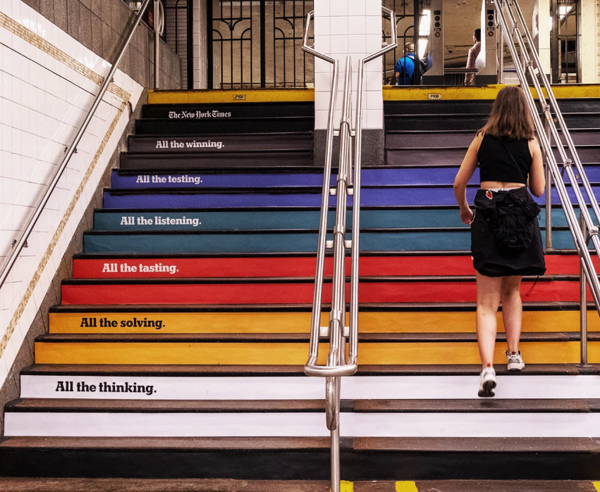
the new york times’ campaign in 2023 is an interesting precedent because of the sheer scale it took. they overhauled grand central station with their brand houses, immersing commuters in the world of an iconic name inside of an iconic station (see more).

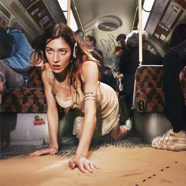
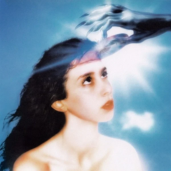
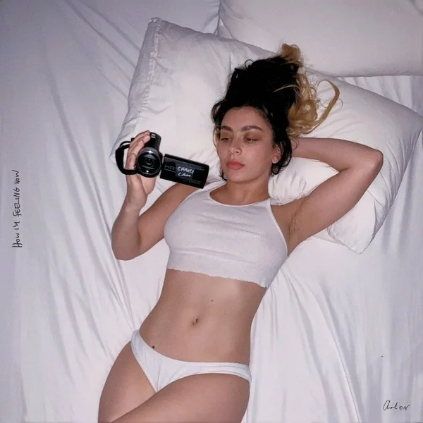
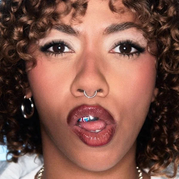
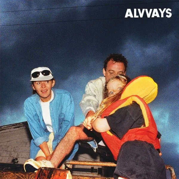
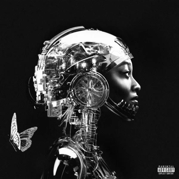
“The subconscious translation of one sensory input to another sensory added a new layer of depth and understanding to the design style”
Music to the ears (and eyes)
pitchfork exists primarily online, which is heavily reflected in their overall creative direction, featuring bold colors, abrasive textures, and cheeky tone.
on a personal note, this project pushed me out of my comfort zone as a designer, especially when it came to embracing a more heavily textured style.
through the process, i took my research into account and immersed myself in the sound that i was trying to characterize. i found myself listening to music with a lot of texture and grit, with sounds from fuzzy guitars, abrasive synths, and bubblegum pop. there was a subconscious translation of the audio-sensory input to a visual-sensory output that added a new depth of understanding to the design style.
Underground,
meet The Underground
The London Underground made for the perfect location for the campaign. It’s a high foot traffic environment that ensures high visibility and exposure for the campaign.
Pitchfork covers a wide range of artists, spanning popularity and genre; some would fall into an “underground” category, which creates a playful tagline for the campaign.
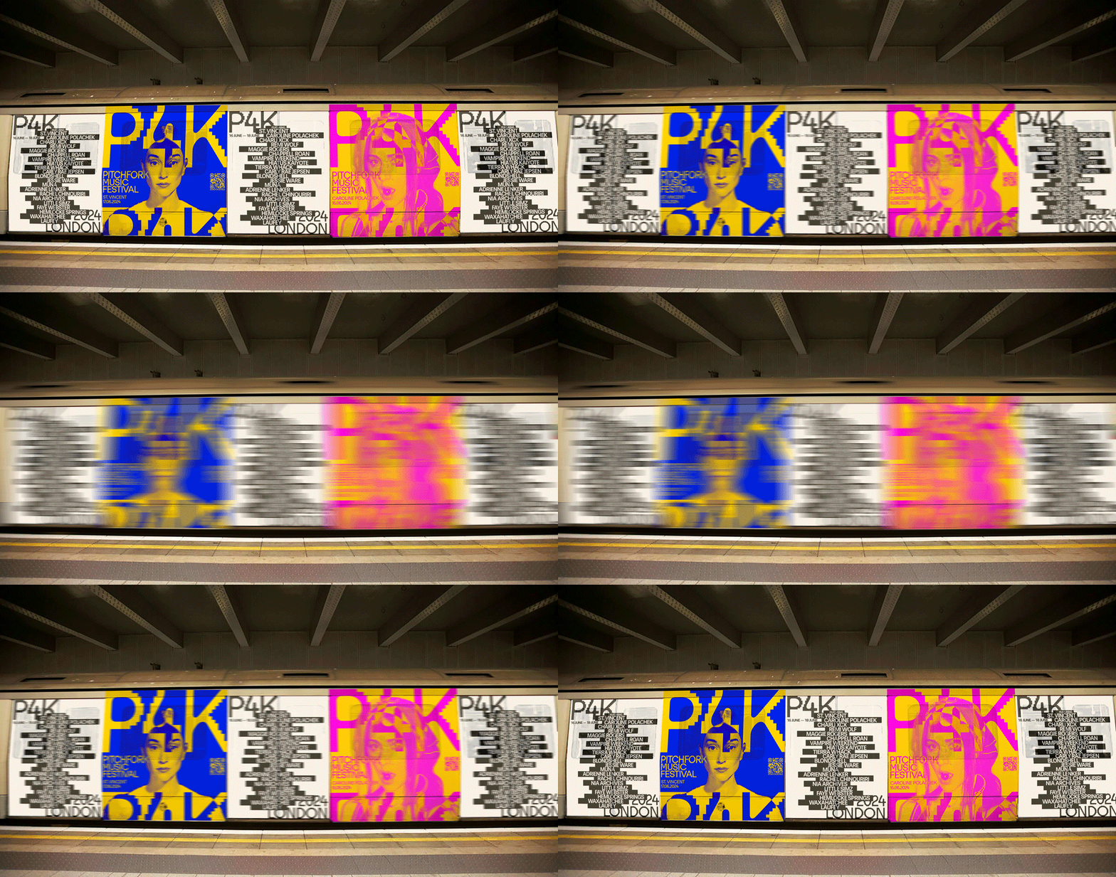
For digital formats, I used existing digital billboards across the London Underground. Using specs from Global Group— an advertising group who designs these billboards— I made both static and dynamic versions of these ads.
Print formats included a series of fly-posters that showcase the vibrant and bold lineup.
The main design initiative took the form of a train car wrap, which boldly features the headlining artists and the festival lineup. Motion was a major consideration when designing this and I had to ensure that the wrap looked enticing both in motion and at a stand still.