
BRANDING, SHAMROCK RAIL SERVICES
BRAND IDENTITY, WEB DESIGN, VERBAL IDENTITY
Shamrock Rail Services LLC (SRS) is backed by more than 35 years of professional experience in the locomotive industry. They tailor custom solutions for clients and provide a wide scope of services, including parts sourcing, operations analytics, inspections, and appraisals/assessments.
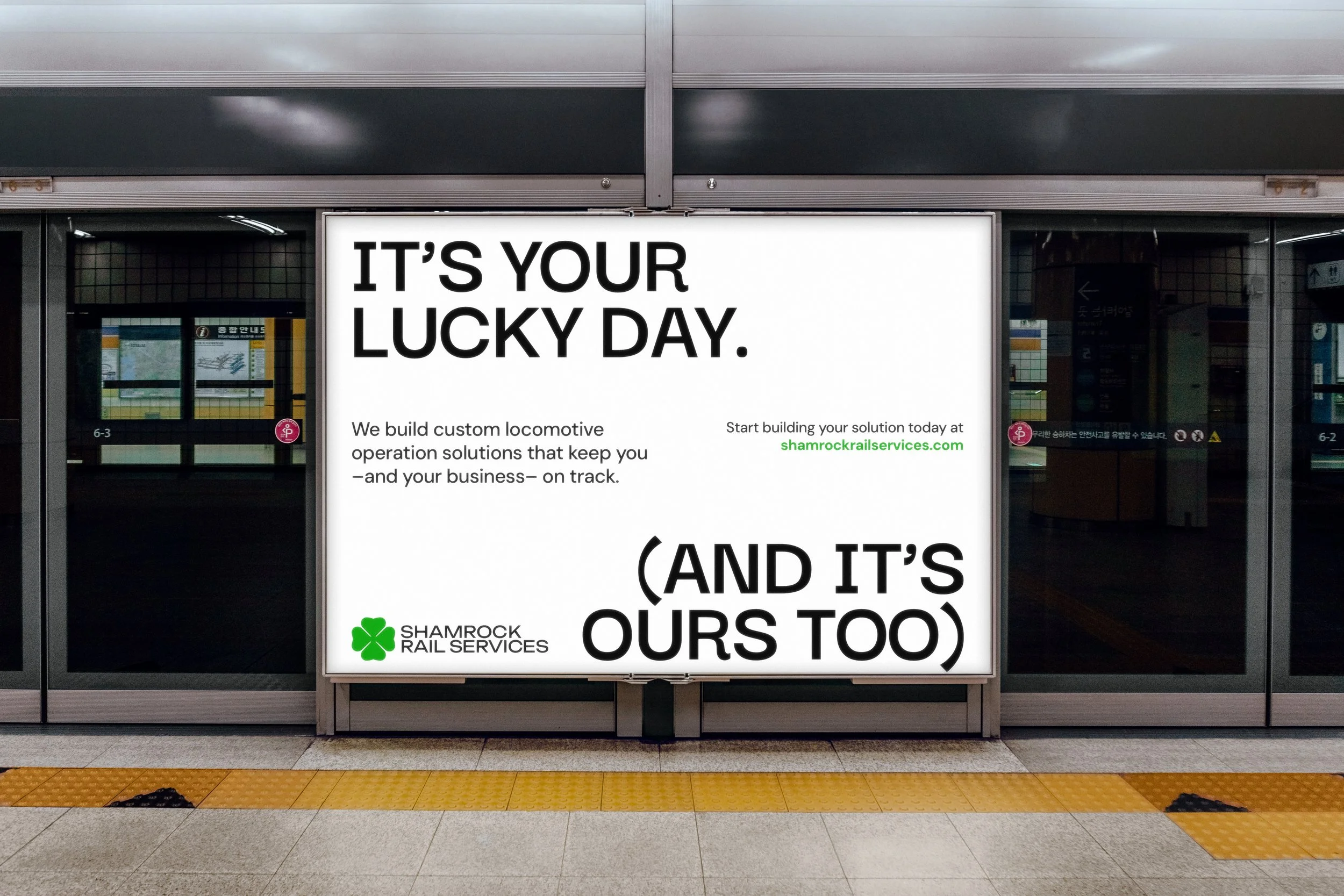
But above all, they foster long-lasting client relationships built on a foundation of trust, integrity, and collaboration. Clients are lucky to have the expertise that SRS brings, and SRS feels lucky to have strong relationships with them.


ABOUT
Traditionally, the locomotive industry operates on a strong word-of-mouth base, which means that building a strong visual identity isn’t always a necessary priority. With the rebrand effort, we aimed to develop an identity that encapsulates the exceptional professionalism and level of service that SRS LLC delivers, and visually push them into a higher level of distinction.
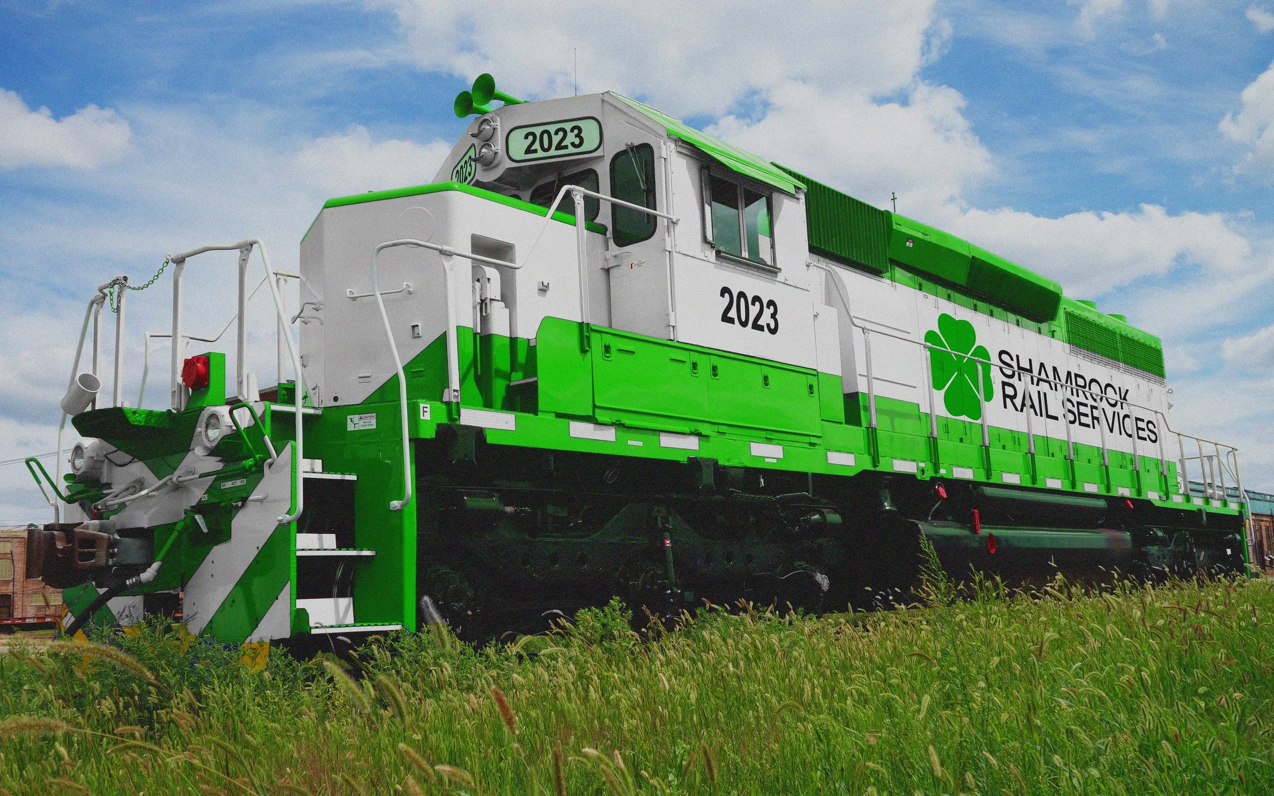
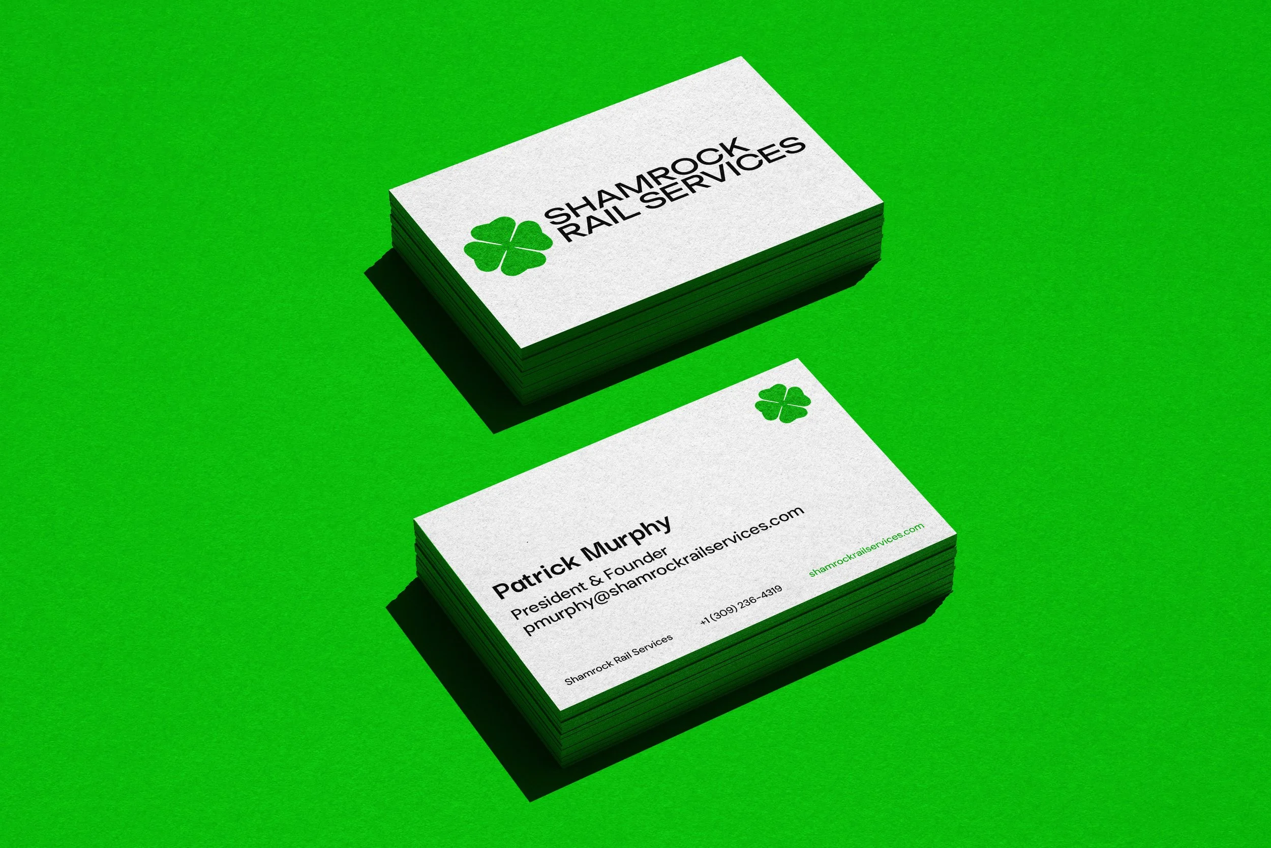
The new logo suite for embraces a crisp, clean style that boldly states its presence with a vibrant shamrock green. The logo and color pay homage to the owner’s Irish heritage, adding a personal touch to the company.
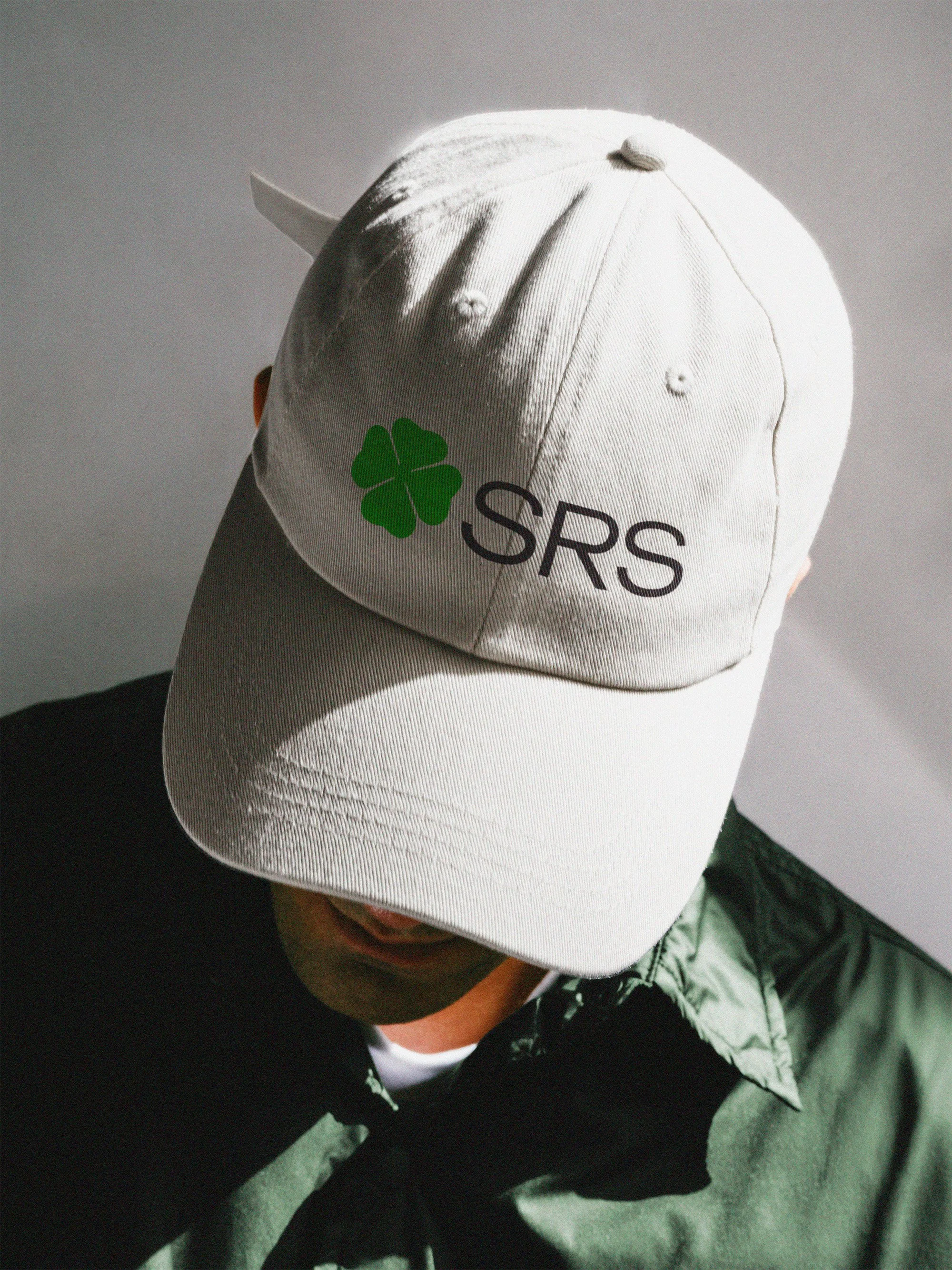
Across all of its channels, Shamrock Rail Services employs their bright, vibrant shamrock green to make themselves known. Shamrock Rail Services often attends trade shows, so they have a wide variety of merch and swag items that are as impactful as they are stylish.
Whether it’s something as small as a business card or as large as a locomotive, Shamrock Rail Services captures attention with its looks and further impresses with their experience and charm.