

Iro Pattern Tiles
Building patterns and knowledge.
Project Scope
Product Design
Graphic Design
Animation
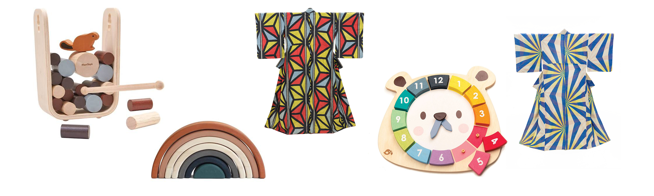
Inspired by Japanese textile design, Iro is an interactive experience designed for kids to build their spatial awareness and understanding of geometrical relationships through the use of pattern tiles. Iro’s inspiration from Japanese culture and design presents a unique opportunity for kids to broaden their cultural awareness as well.
Building on tradition.
Iro is heavily inspired by Montessori school toys, as their interactive nature allows kids to learn in real time as they play. Tactile experiences are a central part to how kids are able to learn with Iro, gaining a better understanding of how shapes interact with one another. The emphasis on natural materials took aesthetic importance as well because I wanted the toy to be something that could be left out and not seen as bothersome in the lived space. The pattern tiles felt like a natural choice because they are visually stimulating and provide the tactile experience of Montessori toys.
After determining that pattern tiles were the direction to go, I decided to look into Japanese textile design as a primary source of inspiration for the patterns. Kimono designers served as a primary source, as well as various printmakers and potters. This not only provided a rich array of designs to derive from, but it presented the opportunity to teach about Japanese design history.
Weaving together history and art.
Iro is heavily inspired by Montessori school toys, as the tactile and open-ended play makes for an engaging experience for kids.
All of the patterns pictured on the final tiles are derived from kimono patterns. I gravitated toward Japanese Art Deco styles because the bold color blocks and patterning would act as a good base point for adding the brand’s palette to the tiles.
There were two groups I had in mind when designing Iro; first and foremost, the kids who are playing with the tiles, but also their guardians. There was a balance in making sure the tiles were bright and eye-grabbing for the kids, but also attractive enough to leave out around the house. The color/pattern palette is inspired by a variety of things, like fashion, textiles, and architecture. In this way, they become an interactive “coffee table book”.


History on your living room floor.
After designing the patterns in Illustrator, they were printed out to scale. The tiles were laser cut and sanded down to take off and sharp edges.
I transferred the patterns onto the tiles via a process called photocopy transfer, which allowed for a color accurate and detailed patterning on top of the tile. Additionally, the process leaves a weathered/worn look that pays homage to the rich history and tradition that inspired the tiles.

Play and learn.
To give a starting point for kids, I created a start guide that gives them some arrangements to start with in order to gain an understanding of how the tiles work with one another; but from this point, the kids are intended to explore beyond the suggestions, creating for themselves. The historical context behind some of the patterns is included in the guide as well, and encourages them to explore further.
Additionally, I animated a commercial (see below) that showcases the versatility of Iro by displaying a variety of patterns that can be made with the tiles.
